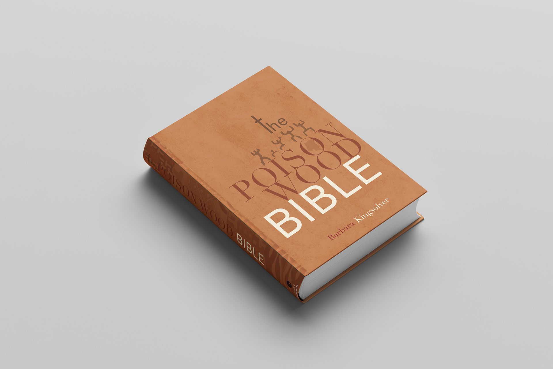
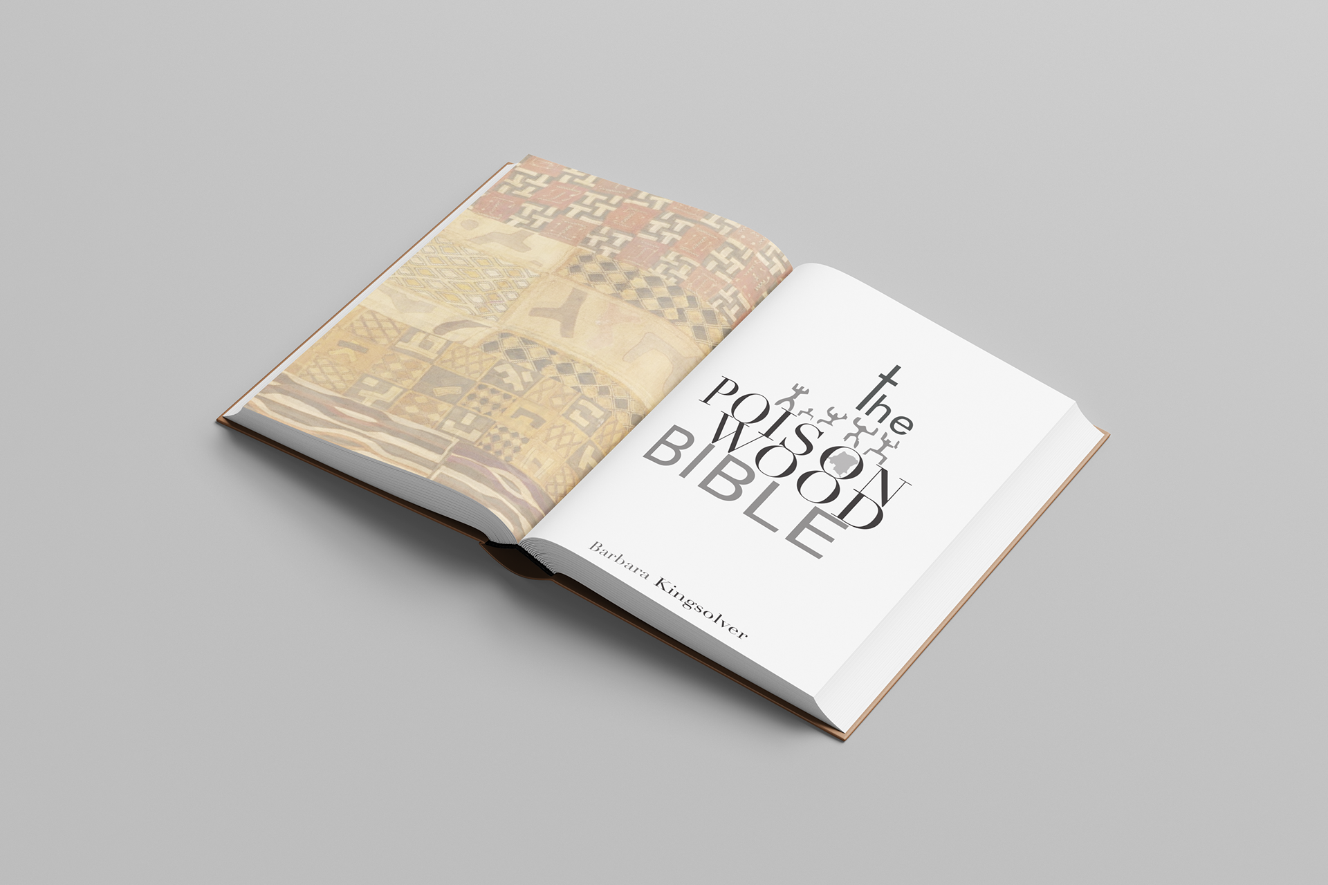

For this redesign of The Poisonwood Bible by Barbara Kingsolver, I focused on complementary type choices and creating a lock-up that incorporates imagery. I used typography as both structure and symbol, turning the “T” into a cross so the title itself reflects the novel’s themes of imposed beliefs and cultural dominance. I referenced traditional patterning and imagery connected to the people of the Congo to represent the tension between dominant culture and lived experience. Because the novel explores religion from a different perspective, I set “BIBLE” in a clean, minimal sans serif instead of the elegant serif it is usually associated with, allowing it to stand out in a more sterile way.